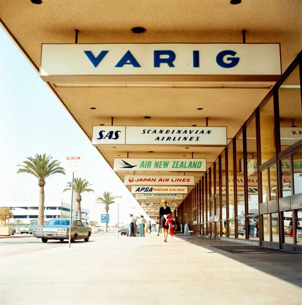
Airline logos are more than just design, they are shorthand for an airline’s identity, reputation, and promise to customers. A good logo communicates heritage and quality instantly, even before you step onboard. A bad one cheapens the brand. Today, I want to share my 10 favorite current airline logos.
Singapore Airlines has used this logo since it split from Malaysia Airlines in 1972. And yes, the logo does look like it is from the 1970s, but I also think it is a symbol of quality and should not be modified. The bird is inspired by a keris, a traditional Southeast Asian dagger.
The calligraphic rendering of the word “Emirates” in Arabic is iconic and timeless.
A great solo travel tip spotted this week on Live and Let's Fly.


